


01
You paste a URL
We work out whether it's a marketing site, a store, a marketplace or a SaaS product, and apply the right lens — nothing to choose.
UX audits for websites, stores and SaaS
Design polish hides issues. Our automated UX audit finds them.








Built by Brave People — Trusted by the world's top brands
No setup, no scripts to install, no Figma to share. Paste a URL and we read the page the way a first-time visitor would — working out what kind of site it is on the way.
01
We work out whether it's a marketing site, a store, a marketplace or a SaaS product, and apply the right lens — nothing to choose.
02
Rendered in desktop, tablet, and mobile views, then checked against 56 UX rules drawn from hundreds of design engagements.
03
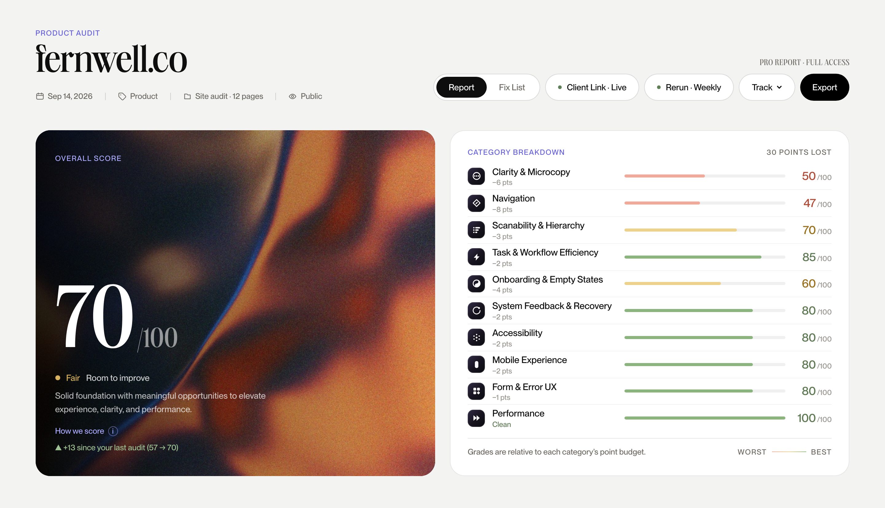
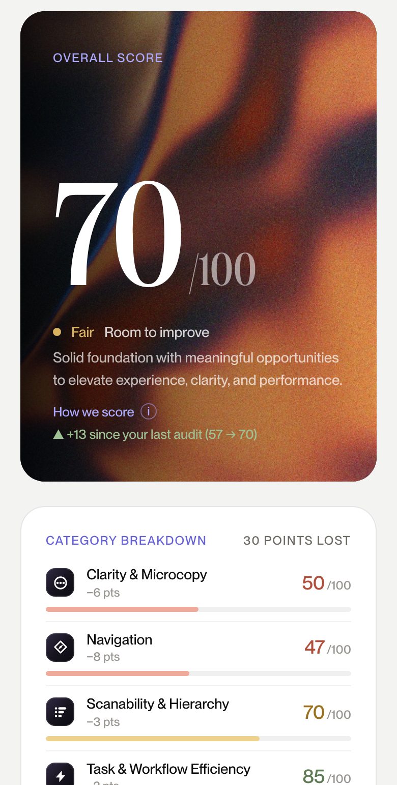
A score out of 100, broken into ten weighted categories, with the most consequential issues in plain English.
Read the way a prospect reads it: what you do, why it's credible, and what to do next. Scored on how little stands between curiosity and a lead.
How 100 points divide
Seven categories are core to every audit. Three swap to match how your kind of experience actually converts.
Categories
Can a first-time visitor say what you do, and for whom, within seconds?
Whether the paths people actually take are obvious, shallow, and consistent.
Where the eye lands first — and whether that order serves the goal.
Every field, step, and doubt between interest and inquiry.
Copy that answers objections instead of describing features.
Proof, polish, and the signals that make a stranger comfortable.
Contrast, focus states, tap targets — WCAG 2.2 AA as a floor, not a feature.
Thumb reach, readable type, and what the fold hides at 390px.
The UX signals search engines read as quality.
Perceived speed: what renders first, and what blocks it.
Judged like a first-time shopper: find it, trust it, buy it without friction. Weighted toward the moments where carts quietly get abandoned.
How 100 points divide
Seven categories are core to every audit. Three swap to match how your kind of experience actually converts.
Categories
Can a first-time visitor say what you do, and for whom, within seconds?
Whether the paths people actually take are obvious, shallow, and consistent.
Where the eye lands first — and whether that order serves the goal.
From cart to confirmation: steps, surprises, abandoned intent.
How the first order feels: guest checkout, sizing doubt, reassurance.
Proof, polish, and the signals that make a stranger comfortable.
Contrast, focus states, tap targets — WCAG 2.2 AA as a floor, not a feature.
Thumb reach, readable type, and what the fold hides at 390px.
Forms that forgive, errors that explain — the texture of daily use.
Perceived speed: what renders first, and what blocks it.
Two audiences, one interface. Weighted toward discovery, listing confidence, and the trust both sides need before they transact.
How 100 points divide
Seven categories are core to every audit. Three swap to match how your kind of experience actually converts.
Categories
Can a first-time visitor say what you do, and for whom, within seconds?
Whether the paths people actually take are obvious, shallow, and consistent.
Where the eye lands first — and whether that order serves the goal.
How fast a browser becomes a buyer on a listing page.
Whether search, filters, and browsing surface the right thing.
Proof, polish, and the signals that make a stranger comfortable.
Contrast, focus states, tap targets — WCAG 2.2 AA as a floor, not a feature.
Thumb reach, readable type, and what the fold hides at 390px.
Listing quality both buyers and sellers can trust.
Perceived speed: what renders first, and what blocks it.
Graded the way a user works it: getting started, getting things done, and staying. Weighted toward task efficiency and the friction that quietly churns accounts.
How 100 points divide
Seven categories are core to every audit. Three swap to match how your kind of experience actually converts.
Categories
Labels, buttons, and messages that say what they mean — words as interface.
Whether the paths people actually take are obvious, shallow, and consistent.
Dashboards and tables that read at a glance, hundreds of times a day.
Steps, clicks, and re-entered context between a user and their job.
From first sign-in to first value: how fast the product proves itself.
Saving states, confirmations, undo — an interface that answers back.
Contrast, focus states, tap targets — WCAG 2.2 AA as a floor, not a feature.
Thumb reach, readable type, and what the fold hides at 390px.
Forms that forgive, errors that explain — the texture of daily use.
Perceived speed: what renders first, and what blocks it.
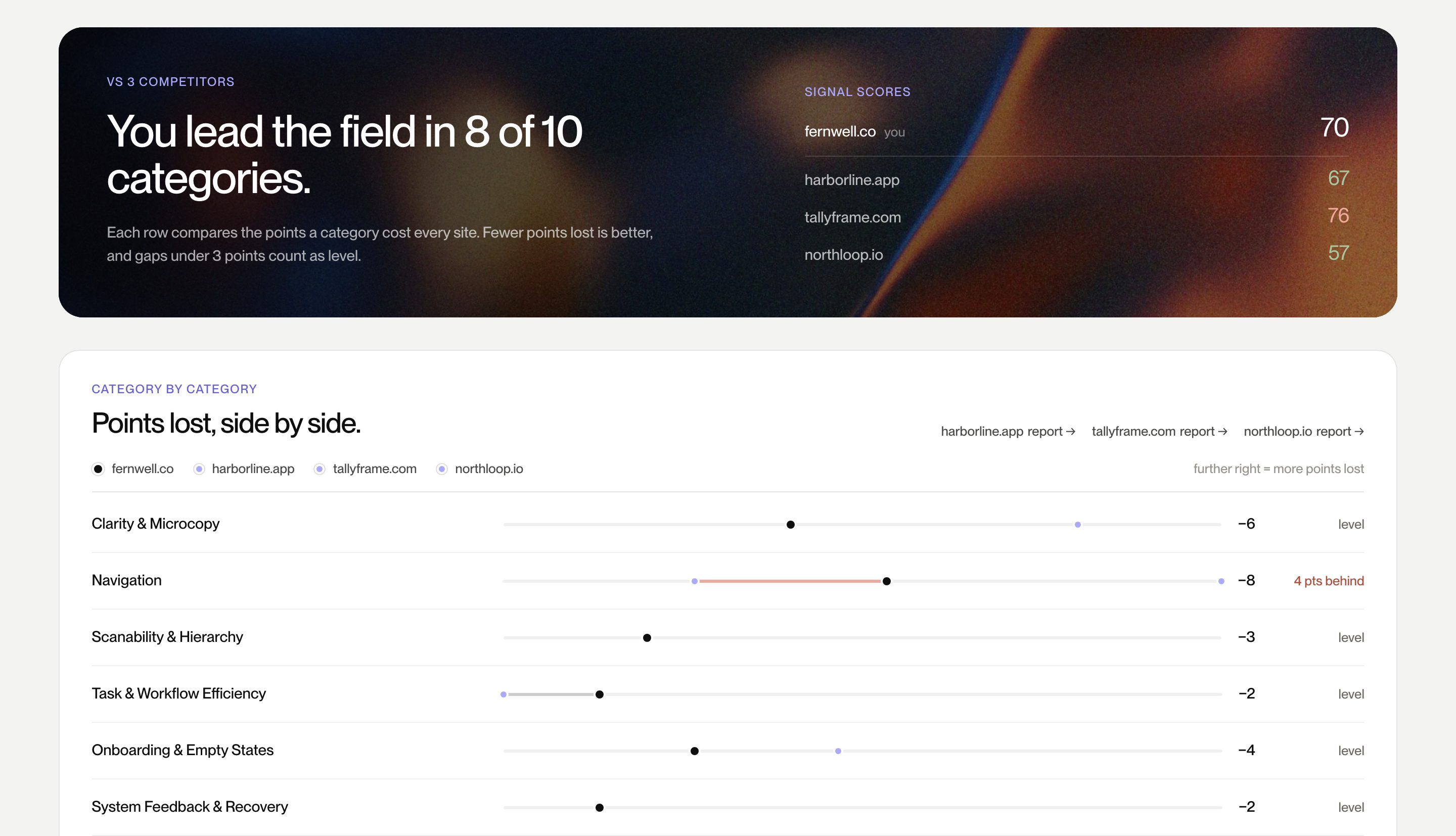
Fresh runs of the public 56-heuristic audit — no special treatment, no hand-picking the flattering ones.
 stripe.com96/100
 vercel.com87/100
 framer.com86/100
 basecamp.com85/100
 shopify.com83/100
 notion.so82/100
 figma.com80/100
 webflow.com74/100
 linear.app72/100
• Consider making your call-to-action more prominent so visitors notice it.
• Your navigation could be more intuitive for first-time users.
• Ensure the site is mobile-friendly and loads quickly.
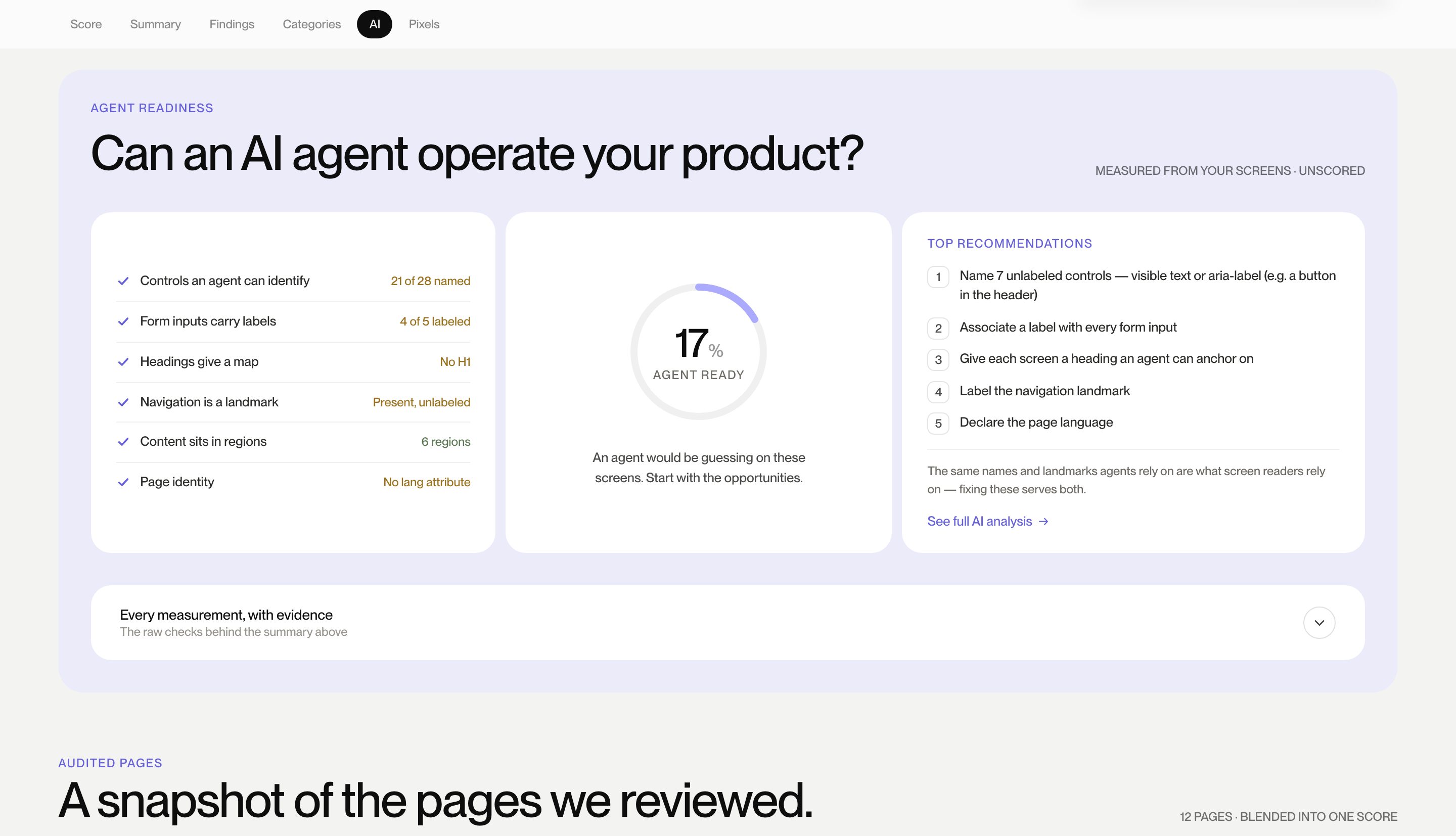
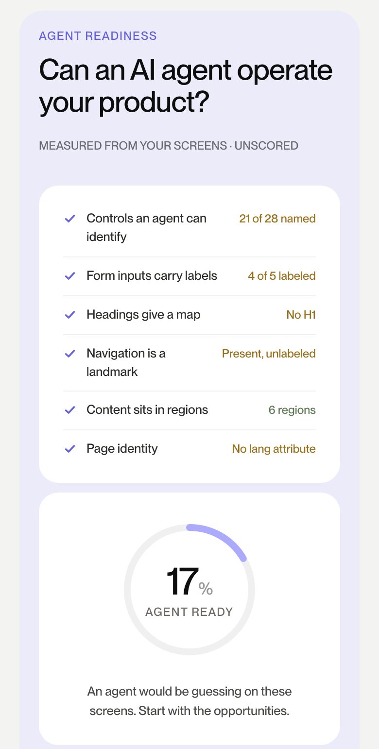
It sees your actual pixels.
Live screens at three viewports, findings tied to captures. You click the evidence.
It scores a fixed rubric.
Fifty-six weighted heuristics, the same yardstick every run. A 62 means the same thing next quarter.
It validates before it scores.
Findings are evidence-checked and counted once per root cause. Unproven stays visible, never scored.
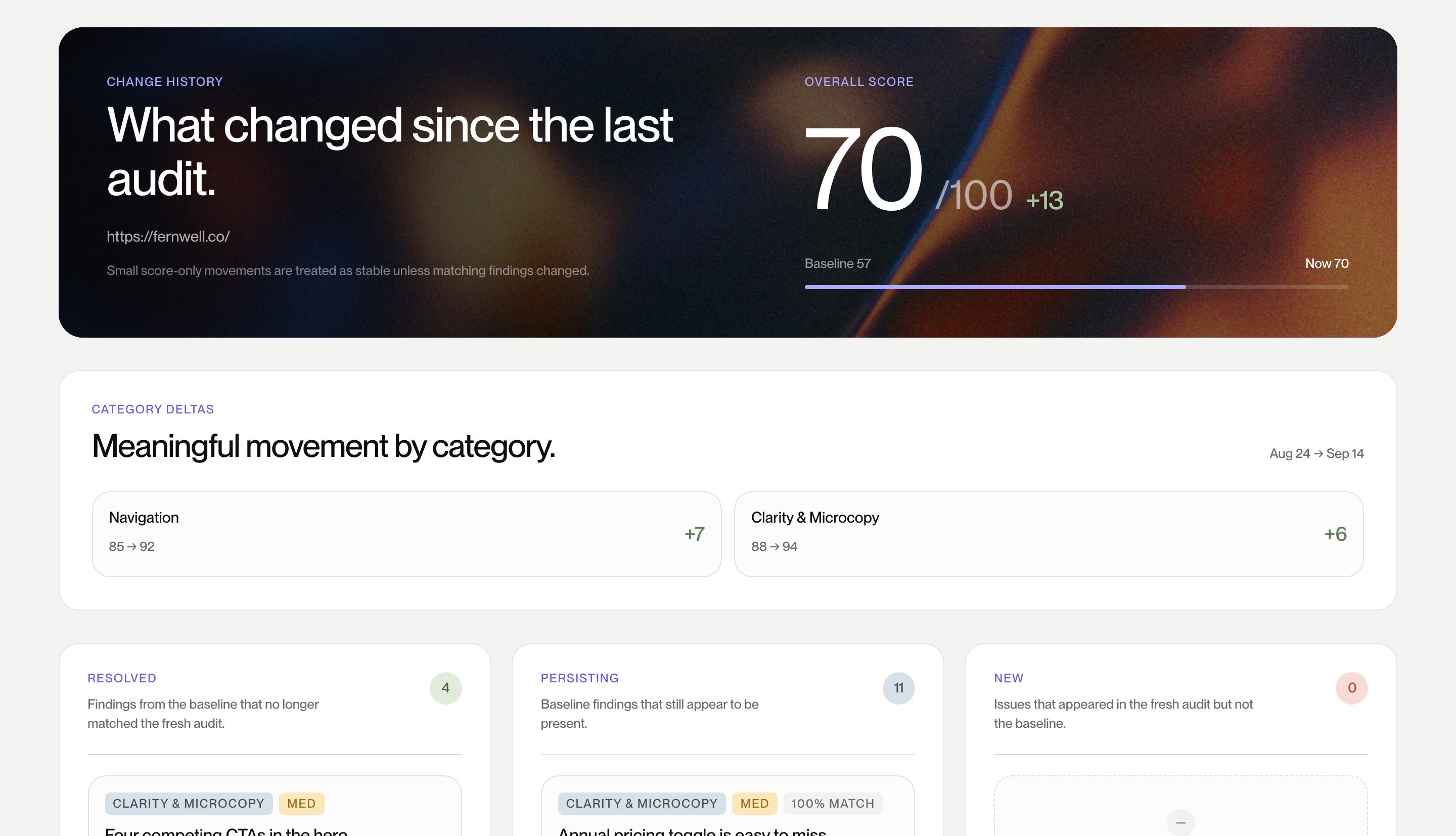
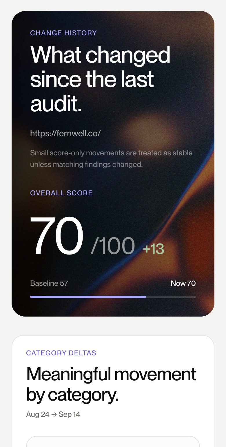
It hands you a plan.
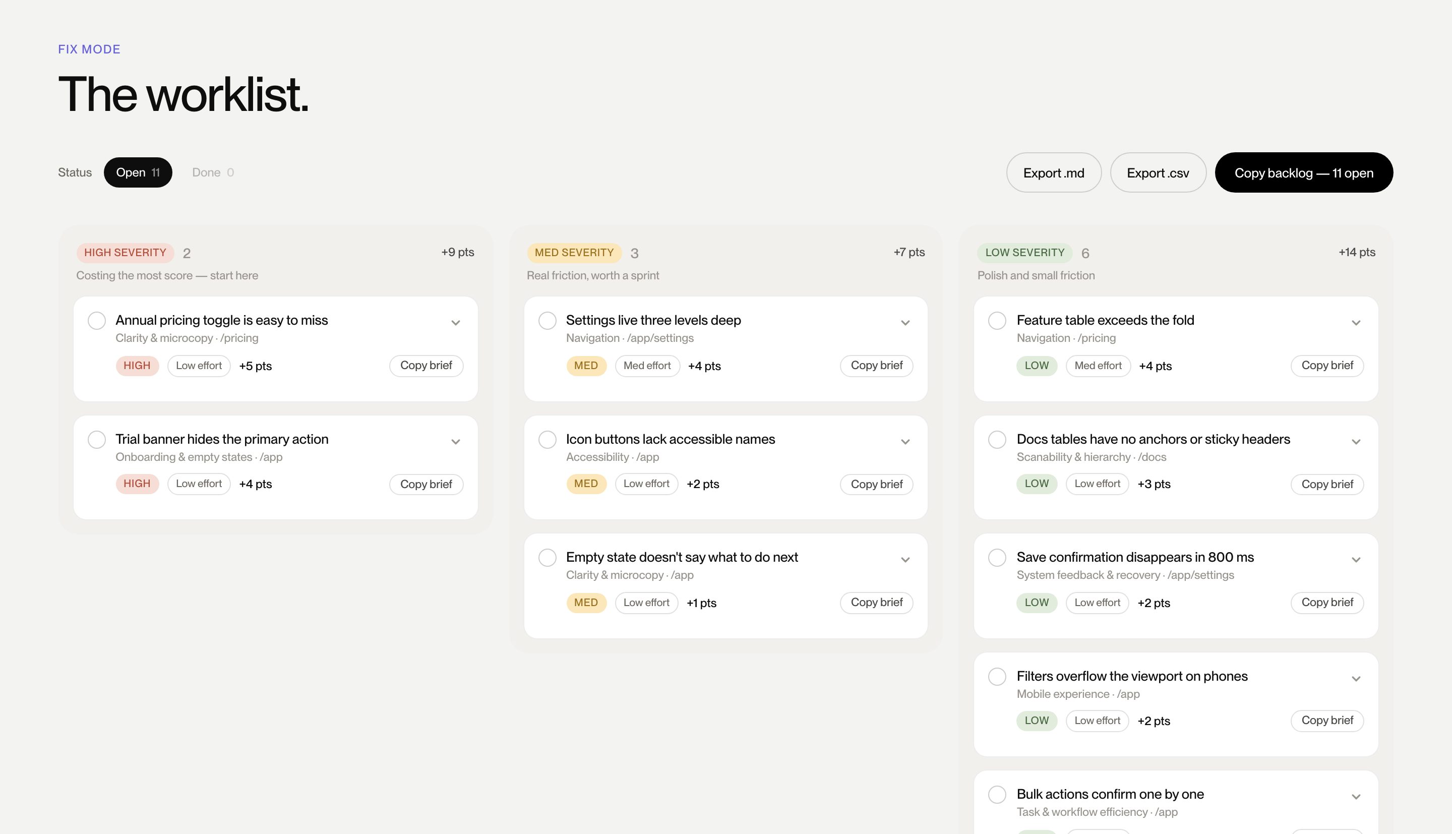
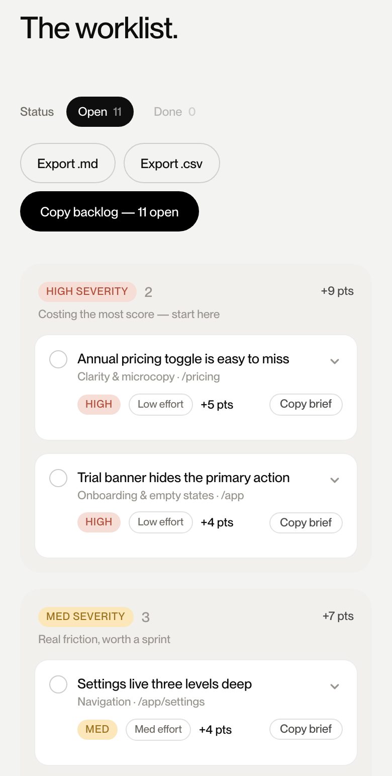
Effort-versus-impact triage, points per fix, and prompts your coding tools can run today.
Yes — your audit lives in your account so the report keeps working. We store what the audit needs: the URL, the rendered screenshots, and the findings. We only load pages any visitor's browser could load, and we don't share or resell any of it.
Lighthouse measures what a machine can score: load times, markup, automatable accessibility checks. We read your page the way a first-time visitor does — whether the message lands, where the eye goes, what erodes trust, and what stands between interest and action — across desktop, tablet, and mobile. Run both; they answer different questions. Performance is one of our ten categories, not the whole story.
Two ways in. For staging sites and password-protected pages, add site access when you run the audit — basic auth, a session cookie, or a bypass header. It's used once for that run, stored encrypted, and destroyed the moment the audit finishes. For your app's logged-in screens, our Capture extension photographs the screens you choose right in your own browser — your password never leaves it — and scores them with product-specific categories like task efficiency, system feedback, and onboarding. It's live in the Chrome Web Store — installing takes ten seconds.
The rubric is ours: 56 weighted heuristics codified by Brave People from hundreds of client design engagements. Our engine applies that rubric to your rendered pages and drafts each finding with evidence screenshots attached — so every recommendation traces back to something you can see on your own site.
Any publicly accessible URL works — some teams audit a competitor to see how their own score compares. The full value shows up on pages you can actually change, so we'd spend your first audit on your own site.
Pro and Team are both month-to-month with no lock-in — cancel anytime and keep access through the end of the period you've already paid for. If an audit fails to complete or the report isn't usable, write to us and we'll make it right.